Learning to Use References
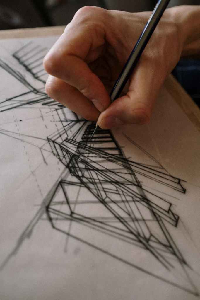
In my first post, I mentioned drawing from references a bit, and I wanted to expand on that a bit more today. Though I’m still learning myself, I feel like learning from references is going to be crucial in learning the art style I want to focus on. While there are a lot of great tutorials out there, there’s not going to be one that exactly matches the art I want to create. As such, I kind of need to figure that out on my own, and using references is great for this. In my opinion, the intent when creating art from a reference photo should not be to recreate the exact photo in detail. Instead, it should be to rearticulate what you see in the reference photo in an artistic style that you like. This could mean referencing a picture of a cheetah to draw a somewhat cartoonish ink-sketch recreation. Or you could recreate the photo by painting the cheetah with realistic proportions and color but allowing the brushstrokes to still poke through on the canvas, giving the piece a delicate- flowy look. Just remember, when you’re creating from reference, try not to focus on making an exact copy. (Unless- that is, that’s the style of art you want to create. If so, go for it!)
Another thing to note here, if you’ve never drawn from reference before, one thing I’d recommend is to stay away from color at first. Unless your main intent is to add a few splashes of color after you finish the piece, trying to recreate a reference with fine color details can really complicate the process. It’s just another variable to work with that may discourage success when you’re just starting out. So give it a go with black and white at first, don’t worry about colors.
Considering the Best Details.
Before you start sketching, one thing you really need to think about is how much detail you want to include from the reference. I’d highly recommend that you avoid going all out in this area, at least at first. For example, if you’ve ever tried painting or drawing a tree, you probably know it’s quite difficult to draw every individual leaf. I can almost recall an attempt in which I tried to draw every leaf on a tree. Needless to say- I don’t recall it turning out particularly well. The tree looked flat, and the leaves could have just as easily been little pebbles. The potential issue with trying to recreate this level of detail is not only the amount of time it takes, but also comes down to being able to identify what all goes into creating the specific detail. For example, consider trying to individually draw every little leaf on a tree- what exactly would go into that? One, you need to make sure that the individual leaf’s size fits the tree and the viewer’s perspective. You also need to consider shape, the leaf’s angle, the amount of light hitting the leaf, the leaf in front of it, and the one behind it… On top of all of that, you have to do that for each and every leaf. So if you do one leaf right, but don’t get something correct on the next one, it could negatively affect the leaf after and so on, leaving your overall composition seeming a bit off. None of this is to say that you can’t get to this point of drawing each individual leaf on a tree, but starting off, I would avoid going for this. (That being said, if drawing these specific details is a huge goal for you, try working towards it by sketching a close-up of a single small branch and the individual leaves on it. Go slow, have fun with it, and pay attention to the little things, and you’ll eventually prepare yourself for the bigger projects.)
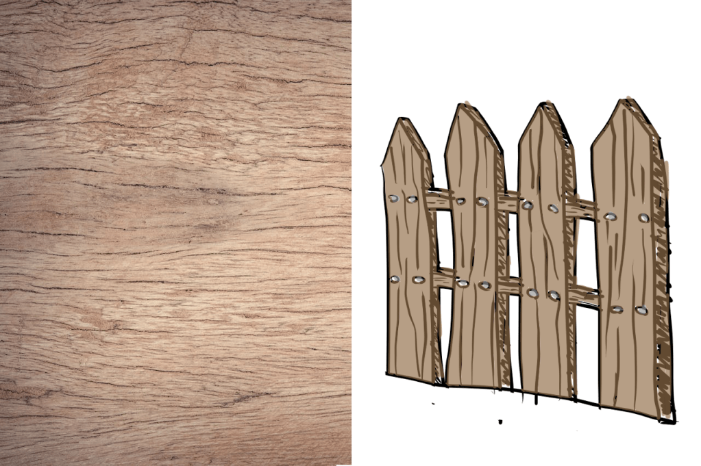
So instead of trying to capture every tiny detail, try capturing the general identifying characteristics. As an example, in a lot of sketches of scenes containing picket fences or wood paneling, you’ll notice that the texture of the wood is often depicted as a few crooked lines running haphazardly along the board. In real life however, if you look at a piece of lumber, you’ll notice there are actually countless little fissures that make up the wood grain, along with the occasional, larger, more prominent ones. Yet most artists don’t worry about adding all these little fissures, instead, they add a few larger lines to give the characteristic of a wood grain, and that’s it. No one questions what the item is because it has that important characteristic that helps define what it is.
Similarly, if you’re trying to sketch a tree from a reference image, try bringing out the leaves by focusing on capturing the overall shape and lines that a clump of leaves forms. And if an area of the tree is in shadow, darken that section by doubling up on whatever technique you use.
Drawing too Straight.
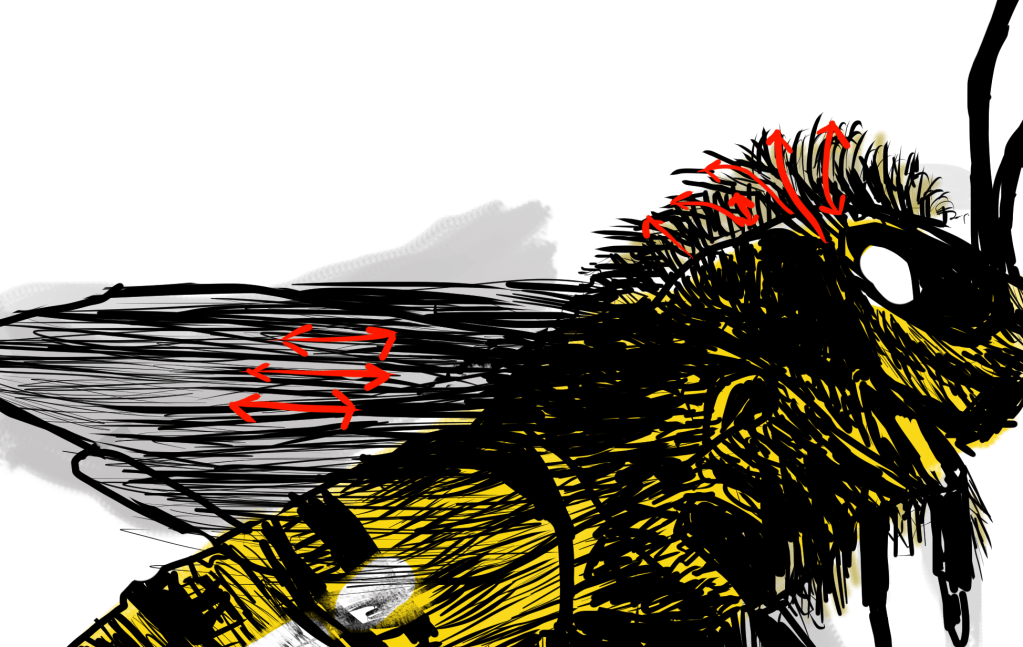
Another thing that I’ve found when drawing from reference is to avoid being overly concerned about creating perfectly straight lines. In fact, I once attempted to digitally draw a biplane. Since I was doing it digitally, I decided to use the line tool so I’d have perfectly straight lines for the wings and other sections. To say the least, I didn’t finish that piece because it just looked too stiff. Plus, because I was overly reliant on the precision line tool, I wasn’t really training myself to draw lines, much less enjoying the process that much. None of this is to say never use a ruler, or a precision line tool; especially if you like the look it helps you to create. But try to draw without these things, especially if you’re drawing something from nature. For instance, it’s not likely that you’ll find a tree in which every one of its limbs is perfectly straight. Nor is it likely that you’ll find a cat that has all its hairs perfectly groomed in one direction. That’s not to say it’s all haphazard- most limbs on a tree branch outward. It’d be a bit unnatural to see a huge branch in the shape of a zigzag. The same thing goes with fur- even though it’s not perfectly straight, the clumps of fur usually follow a general direction. (As an example of this- notice how the bits of texture/hairs in the bee sketch follow a general direction- they aren’t random crisscross strokes.)
Even when you’re drawing manmade things that have a tendency to be straight, don’t worry about making your lines completely accurate. To me, this can make art more interesting and unique.
(Here’s a link to the YouTube short showing the Bee if your interested: https://youtube.com/shorts/uDV_5ThIIP0 )
A Nice Starting Point.
Another thing that I think is crucial when working with a reference picture is to start on the broad things. Don’t start on the small details first- admittedly they can be the most entertaining sections to work on, but if you do all of them first, then try to connect them together with the broader details, you may find that the proportions aren’t quite correct. For instance, imagine if a person were attempting to draw a house from reference, but they started on the windows and door first. They get these big windows sketched, then they start to draw a line to indicate the roof or walls. Immediately, something doesn’t appear to be right. In this case, it’s quite possible that they drew the windows or door so big that, to be proportional to the house itself, they would have to extend the piece of paper to fit the rest of the house in it. If that person had instead started on the larger details like the roof and walls, they would’ve had an easier time finishing the piece. Specifically, it would’ve created a point of reference to ensure the location and proportions for the windows and door were correct.
Simplify the Big Picture.
Something else that might make it easier when drawing from reference is to break up the main shape of the subject into simpler shapes. For instance, if you’re trying to draw a building of some sort, you may find yourself tempted to draw the outer walls and the roof as a single shape. Here’s the thing, when you do that, you may have a harder time defining the overall shape because you’re trying to account for too many different corners or angles at once. So when you can, try to break it down into simpler shapes, and the overall proportions might come out a bit better. (Here’s an example to show what I mean.)

(When I originally sketched this piano, I wasn’t simplifying the shapes. So it took several times for me to get the curve of the piano’s cover. If I had outlined the simple shapes, I would’ve had a guide that would’ve made it much easier.) And if you don’t want the extra lines that accompany the effort of breaking something down into simpler shapes, just try to make a light sketch in which you can erase the extra lines afterward. If you’re drawing with a more permanent medium, you might be able to draw out the simpler shapes on one piece of paper, and then overlay another piece of paper to copy the overall shape.
Lasts Thoughts.
I wish I’d been doing all the things that I mentioned here when I was first starting out trying to draw things from reference. If I would’ve, I have a feeling I would’ve had much more success. And I probably would’ve completed pieces quicker, instead of continually restarting or having to erase something halfway through to correct it.
I hope something that I’ve mentioned here will be of help to you as you’re creating art from references. Just, whatever you do, keep practicing, and you’ll eventually get to where you want to be as an artist.

Leave a comment